Web Ui Design For The Human Eye
Web UI Design for the Human Eye: Content Patterns and Typography — Part 1
![]()
This is an excerpt from the Web UI Design for the Human Eye: Content Patterns and Typography ebook, written by Jerry Cao, Kamil Zięba, Krzysztof Stryjewski, Matt Ellis, and originally published on UXPin.com .
Real Content vs. Lorem Ipsum
Design in the absence of content is not design, it's decoration.
Jeffrey Zeldman
We've said it before and we'll say it again: content is king.
That means content should not be the last stage in design, something to be filled in right before the launch. Content is the backbone of your site and must be developed together with the visual design.
Sure, using a place h older like lorem ipsum is tempting with its convenience — but ultimately it will hold you back. For starters, using a placeholder perpetuates the idea that content is secondary. But more importantly, using lorem ipsum means passing up the opportunity to further improve your site's most important asset: the content.
In this piece, we'll discuss why real content matters, then review
how you can take a more content-first approach to your site design.
The Real Pitfalls of Fake Text
It may seem like an insignificant point, but avoiding filler content does make a difference.
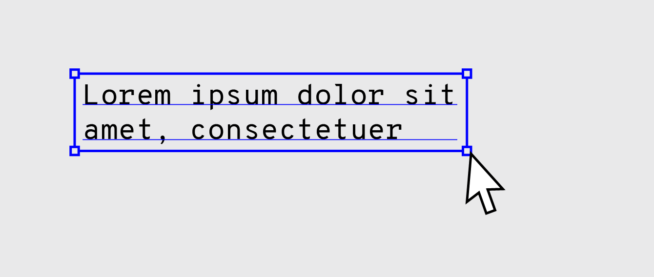
In our experience, the only time-filler content is acceptable is during very early stages of design when you're trying to brainstorm as many usable layouts as possible. In that case, lorem ipsum can help as a quick and dirty way of getting something to fill the space so you can get a rough idea of the full aesthetics of a layout.
Approach lorem ipsum the same way you would an early sketch. Play around with it, use it to arrive at better design ideas, and then move on.
As we discussed in the Guide to Usability Testing, a webpage with a simple structure but quality content performs much better on usability tests than a nice layout with subpar text. That at least proves its worth — but the importance of content in design goes even farther beyond that.
[Once you progress beyond low fidelity, ditch the lorem ipsum.]
Words are the foundation of all interaction. They are the language used for primary communication with your user, regardless of how engaging the other interface elements are. Content Strategist Ahava Leibtag said it best:
We need to start urging our clients to think about their content not just as a commodity, but as the starting point, the building blocks of a website. It's time to stop building the house without knowing how many bedrooms it may need. Because you know what they call things that are beautiful, but have no function? Useless.
This seems like an obvious argument, and yet some designers might still attempt content shortcuts until the zero hour. But why?
In an interview with Adaptive Path, Kristina Halvorson, founder of Brain Traffic, explains that the clients (and sometimes stakeholders) are partly at fault. According to her, clients and internal teams might urge designers to deliver designs and structure as quickly as possible — spending time on content then slows down the completion of the deliverables that the clients want to see.
Halvorson goes on to explain that designers use lorem ipsum as a way to focus on the layout, but this is counter-intuitive. The layout should be built around the content, not the other way around. The structure and flow of a page should heighten the effect of the words, but that's impossible if it's built with nonsense words that will eventually be replaced.
In her opinion, content strategists, web writers, editors, or any other kind of representatives of content should be present at the drawing board with designers and the product team from day one. This not only gives a head start to the writing, but it also holds someone accountable for the content throughout the process.
And what's the alternative, when you don't design for content?
Rian van der Merwe, in an article for Elezea, describes with visual aids the all-to-common approach when content is a secondary concern to design. A typical wireframe with lorem ipsum placeholders would look like this:
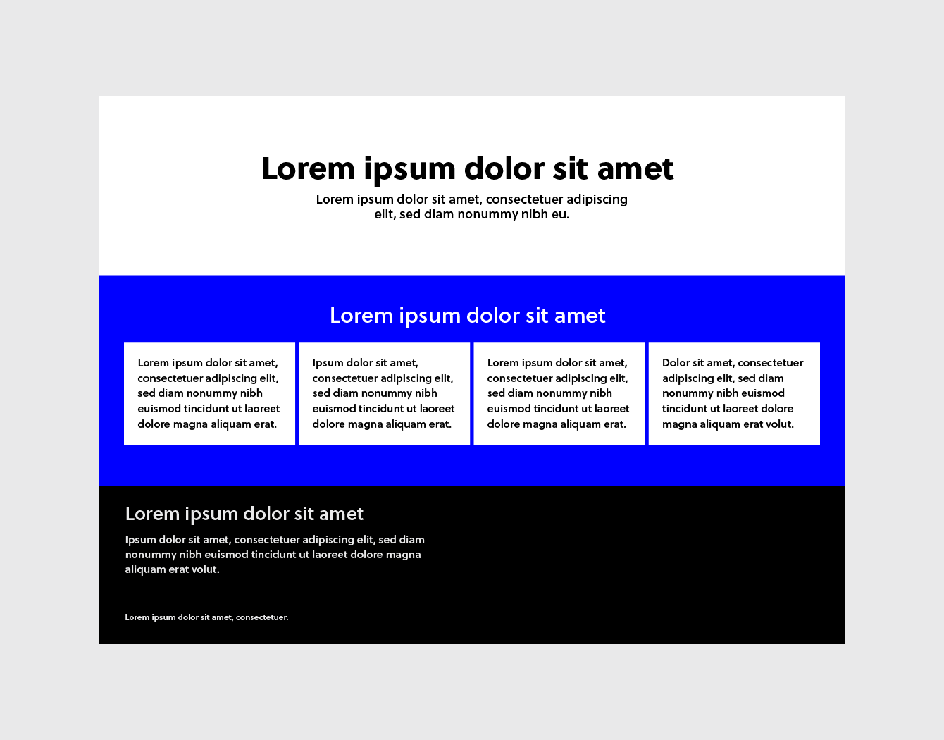
It looks fine, doesn't it? After all, the layout and structure were all designed to perfectly fit the lorem ipsum text, so everything is in order. But what happens when it's time to add the actual content?
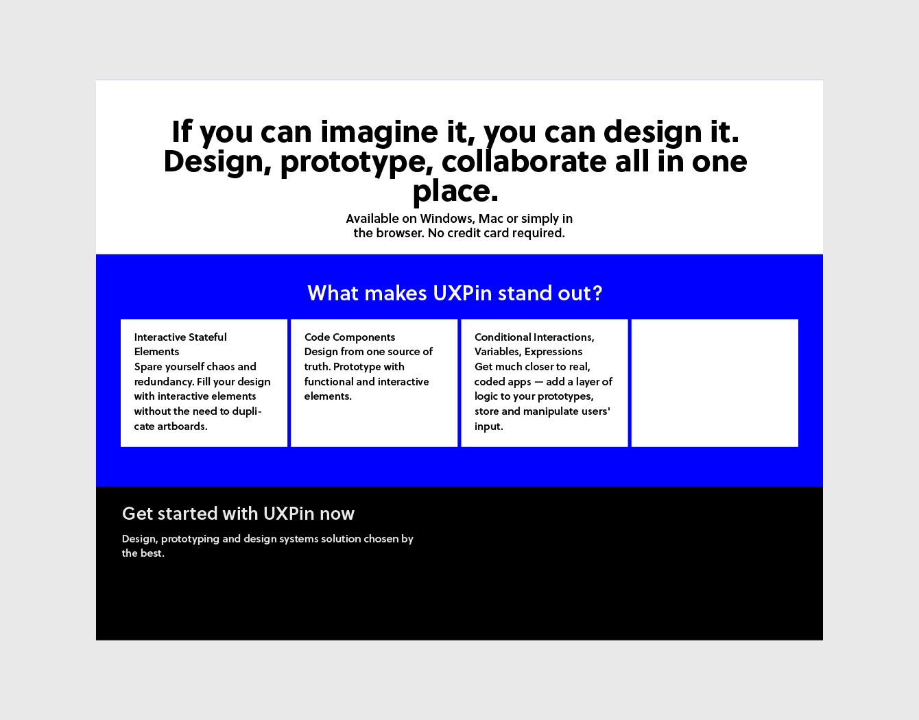
The chances that your actual content will fill the same space as your placeholder are very slim, almost inconceivable. In most cases, at least some redesigning and restructuring must be done, which is a waste of time and resources.
As Merwe describes it, the design is the packaging for the content. If you design the packaging first, you're doing so without knowing what's going into it. When, inevitably, the content doesn't fit the packaging, you must either start over with a new design or alter the content to make it fit by sacrificing some parts or adding filler.
Developing content early ensures its place at the top of your priorities. It's better to modify a design around the content than the content around design.
Additionally, avoiding lorem ipsum placeholders can also safeguard against embarrassing mistakes. You don't want your site to accidentally end up like this:
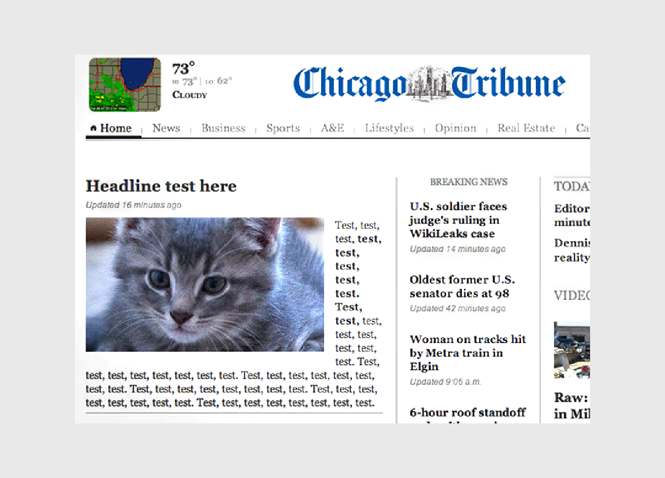
To learn more about how words, language, and content affect the user experience, check out the free ebook Interaction Design Best Practices: Mastering the Tangibles.
Applying the Content-First Approach
Don't get us wrong — no one's expecting your content to be perfect before the rest of the design commences. It's usually a gradual process, as with the other areas. The content doesn't need to be finished early. We're saying it should be started early.
Let's look at a few tips from Liam King, who we think has provided some of the most practical advice on the matter.
1. Write the Content Yourself
UX designers aren't copywriters, but this isn't the final version. With your experience in web design, you know enough about written text to create valid proto-content — content that will be
later improved and perfected by a professional copywriter. For the time being, though, your text will be close enough to a working copy to be able to design around. We don't just recommend this method — we practice it ourselves here at UXPin.
The downside to this method is, yes, it is more time and effort on your part, especially in comparison to copying-and-pasting the content from a lorem ipsum generator. However, it's worth the extra effort: the end product can only benefit from content being generated as early as possible.
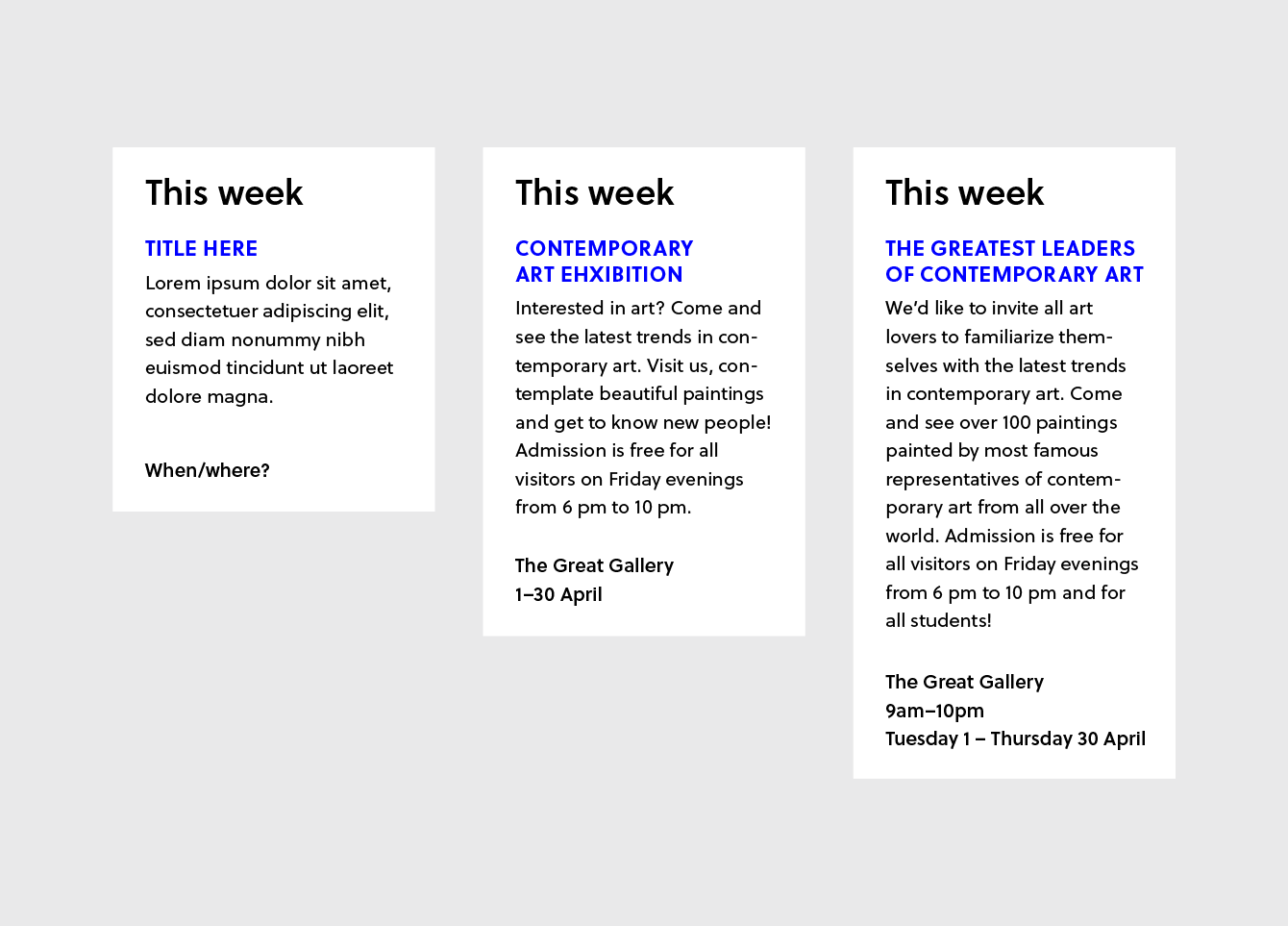
The first example on the left is the notorious lorem ipsum, the second example is content fit for print, and the third example is a rough but adequate content for design purposes.
As you can see in these examples, even the rough third example still gives the designer more valuable insight than the lorem ipsum. While not perfect, the third "proto-content" still draws attention to a lot of important design issues that should be addressed, such as:
- the name of the exhibition is too long
- multi-day events could cause problems
- promo panels must support long titles
- the time and date format isn't very readable
No, the third example is not perfect. But the important point to remember is that all of the above issues would have gone ignored until the final stages (where they would be rushed to complete) if the lorem ipsum content was preserved through the process.
2. Design with Existing Content
While this method is not applicable if you're building a brand new site, it's quite helpful if you're redesigning an existing site. The old site's content will be a much more helpful placeholder than the meaningless lorem ipsum. Granted, it won't be a perfect match for your new content after the rewrites, but chances are it will be similar enough to work.
Like King says, content like staff profiles and about pages will probably not be changed radically, and previously written articles and posts won't be changed at all. Try copying and pasting your pre-existing text into a wireframe/prototype to see how it looks.
3. Pull Content from Competitors
While we don't necessarily recommend this method as a first choice, it's still better than a generic placeholder (think of it as a "smart lorem ipsum").
The procedure is pretty self-explanatory: simply copy and paste some relevant example text from your competitor (or competitors), then change the names, places, etc. accordingly. It will be a lot more suitable than lorem ipsum, plus you can take an in-depth look at how they designed for the same issues.
If you're like further details into the processes of designing your site around content, the Web Standards Sherpa has an excellent post about the methodology behind what they call "messaging hierarchy."
Before you create your content, plan it out using a Page Table template. Once you've created your content, you can help structure it in your design with Content Slice Diagrams.
Takeaway
It's a fact that can't be overstated: content is king.
Any extra time and effort spent on developing content, no matter how superfluous it seems, will improve the end product. You'll want to start on your content as early as possible, and avoid the corner-cutting use of generic placeholders like lorem ipsum.
By the time your content audit comes around, you'll notice a drastic difference between content that was originally planned since the beginning and content that was written at the end and jammed into the already-made design.
Designing for Scanning: F-Pattern
Don't be fooled: chances are, your users scan your content for the best parts. Don't take it personally, it's nothing against your content (and doesn't undermine its value), it's just standard user behavior.
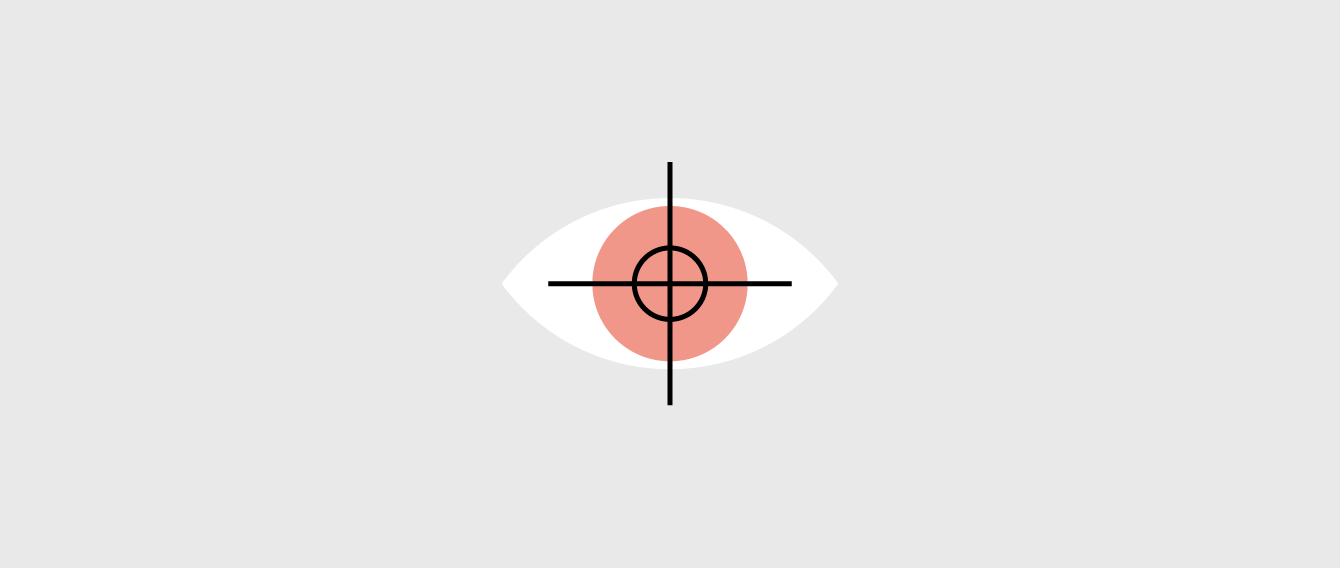
The F-pattern is the go-to layout for text-heavy websites like news sites, blogs, or in-depth landing pages. Once we explain how and why it works, you'll start to notice its use on popular sites all over the web.
What is the F-Pattern?
The F-Pattern describes the most common user eye-scanning patterns when it comes to blocks of content.
The F refers to the reader first scanning a horizontal line across the top of the screen, as is understandable for cultures that read left-to-right. Next, the user scans a vertical line down the left side of the screen, looking for keywords or points of interest in the paragraph's initial sentences or subsection titles. When the reader finds something they like, they begin reading normally, forming horizontal lines.
The result is something that looks like the letters F or E. As shown in Web UI Patterns 2014, CNN and NYTimes both use the F-Pattern.
Jakob Nielson of the Nielsen Norman Group conducted a readability study based on 232 users scanning thousands of websites and elaborates on the practical implications of the F-Pattern:
- Users will rarely read every word of your text (in fact, only 20%)
- The first two sections are the most important and should contain your hook.
- Cover only one idea per paragraph, using bullets as much as possible
- Start paragraphs and new sections with enticing keywords.
How could this impact the interface design of your website? Take a look below.
How to Use the F-Pattern
The below example, from Brandon Jones's piece on the subject, visualizes the F-Pattern.
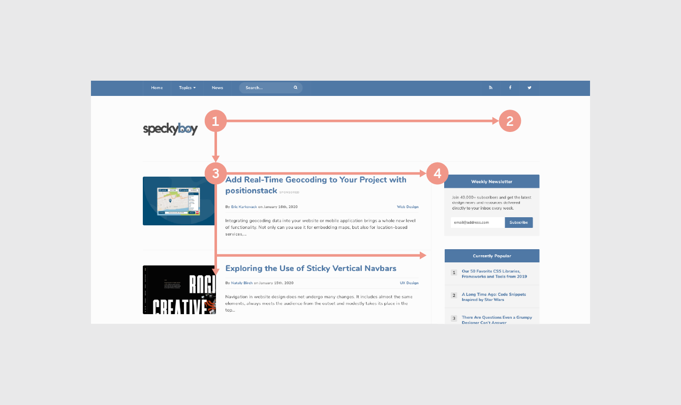
You'll want to place your best content across the top, with a solid anchor in the upper-left corner (Point 1), the only spot practically guaranteed to get noticed. That's why you commonly see a company's logo here.
Commonly, designers will put the navigation bar across the top leading to the upper-right corner (Point 2). This makes it convenient for users who are searching for a keyword that is the title of its section, for example, "Help." Designers vary on how thick or catchy they make the top bar: a thin, subtle top line will encourage further scanning immediately, while a bigger one will take advantage more of its dominant position, promoting the content therein at the cost of the content below it.
After the top row, the user will drop down to the next noticeable section (Point 3) and repeat the process (Point 4). In theory, users will continue going down the page until they find something of interest, but in reality, they will likely leave after a few seconds unless you can hold their attention.
For this reason, experts recommend breaking up the monotony with an "awkward" element after the first 2 or 3 rows — anything that disrupts the routine. This can be any variation of the earlier rows, just to keep the page visually stimulating. Standard practice is to break the convention every 1,000 pixels beneath the fold.
The visual aid below is a nice reminder of how the F-pattern works.
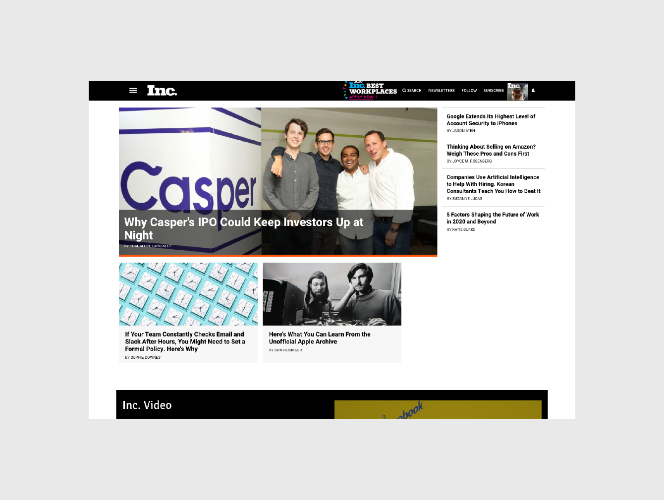
It's worth noting that the end of each row (where Points 2 and 4, etc. are located), are the best places for advertisements and calls-to-action due to the momentary pause before moving to the next row. That's why you see the "New eBook Out Now!" call to action placed at the end of the first row of content.
The F-pattern works great for these motives, as they noticeably present these options, but without distracting from the primary content. Just remember that content is always king, and the sidebar exists only to get users involved on a deeper level.
With the F-pattern, the righthand sidebar may serve 2 main purposes:
- Featuring relevant but unrelated content — Anything you want your user to see, but that doesn't fit in organically with the primary content. These could be advertisements, links to other posts, a social media widget, etc.
- As a search tool — This place could host a search bar, but could also have category listings, tag clouds, a "popular posts" widget, etc.
This is a lot to take in at once, so we'll show you what we mean with some examples below.
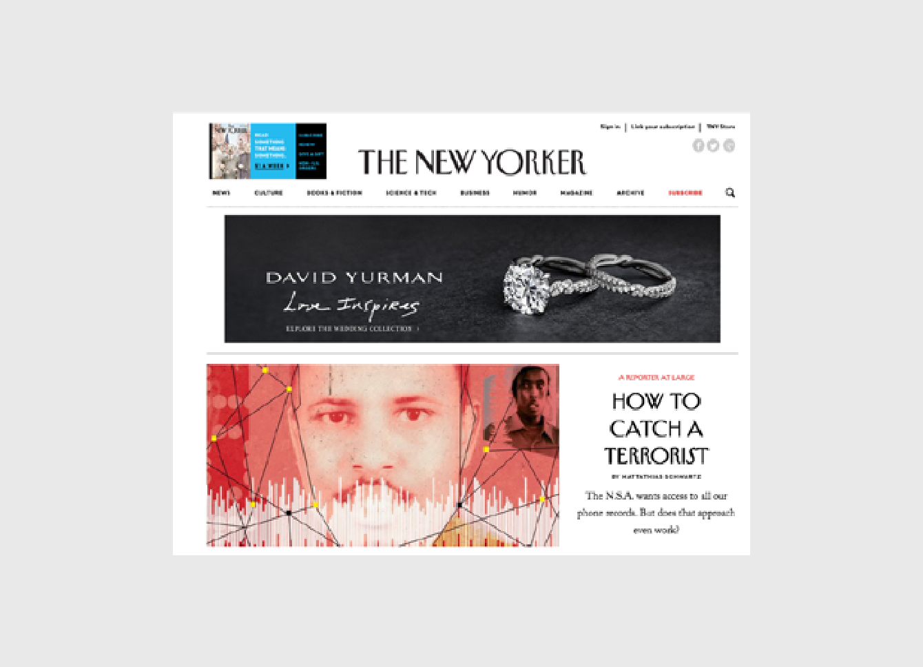
The New Yorker shows that the F-Pattern works especially well for sites that naturally feature advertisements. The first David Yurman advertisement is noticeable, but not distracting thanks to the use of red in the primary photo. As we described before, this advertisement is again shown at the end of the second row of content, where the eye naturally pauses.
You can see this pattern adapted for sites with sparse copy as well.
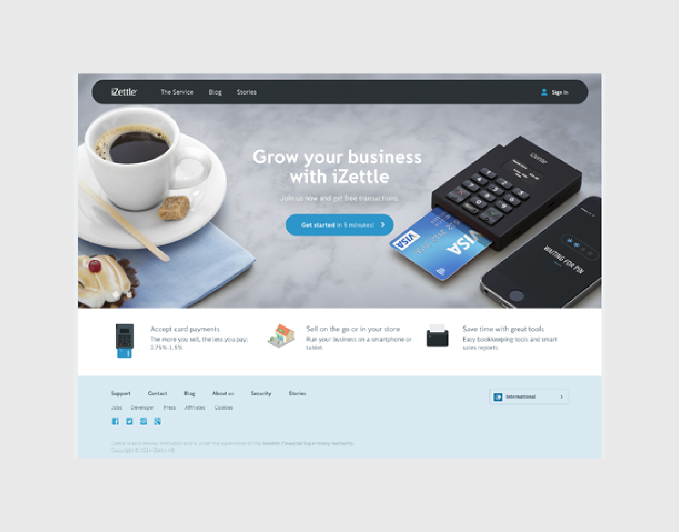
iZettle takes a less conventional approach to the F-pattern on their homepage. Its layout represents a hybrid of the F-pattern mixed with the Z-pattern (which we discuss later).
They manage to avoid a templated look by overlaying the primary copy ("Grow your business with iZettle") and the call-to-action on a large background image. We'd consider this the bare minimum for adapting this reading pattern to your interface layout — no doubt there are visually sexier examples out there, but this still gets the job done.
Why Is This Pattern Effective?
Designers use the F-pattern repeatedly because it mimics users' natural sight patterns. Most people have been reading top to bottom, left to right their entire lives.
Designing a site layout with the F-pattern flows with the current, encouraging the user's sight to follow naturally. Conversely, content-heavy sites that ignore the F-pattern are creating unnecessary strife by forcing the readers to readjust their natural eye movement.
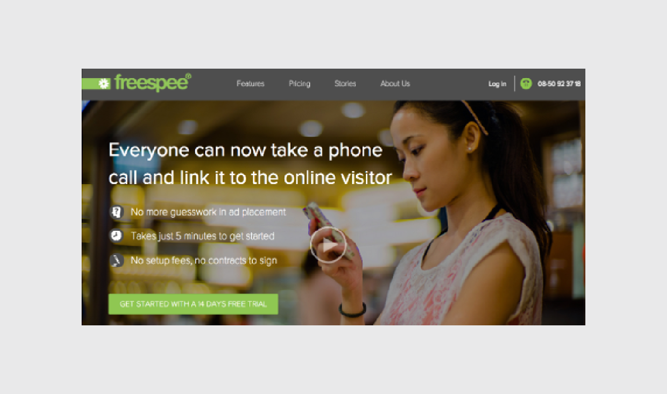
Site layout affects conversions, so it's important to know the value of your on-screen real estate. Take Freespee as an example; after redesigning their site into the above version, subsequent A/B testing revealed that they could increase their phone conversation rate by30% for the same ad spend, simply by putting their phone number in a more prime location in the upper right.
Now, the above example is by no means a perfect design. They could make the bullet copy more prominent, and replace the background stock image with a visual that supports the described values. But that perhaps speaks even more about the power of layout: even if your typography and graphics aren't the best, adapting your layout for human reading can still improve site performance.
That being said, let's dissect what they've done right:
- The top-left logo attracts attention at point 1, where users naturally scan the navigation, perform searches, or any other top-level actions
- The top-right phone number shown at point 2 is the first call to action. Since it's highlighted in green, this further attracts the right attention.
- In the body of the page, concise bullets are featured at point 3. This text is structured like a "mini F-pattern" so that the eye naturally moves down to the call-to-action
But the F-Pattern is not infallible. The main drawback to this layout is its predisposition to monotony — it's easy to bore your users with repetitive and similar content in your rows. This is precisely why it's advised to throw in an "awkward" row every and then; the variation helps hold the users' attention.
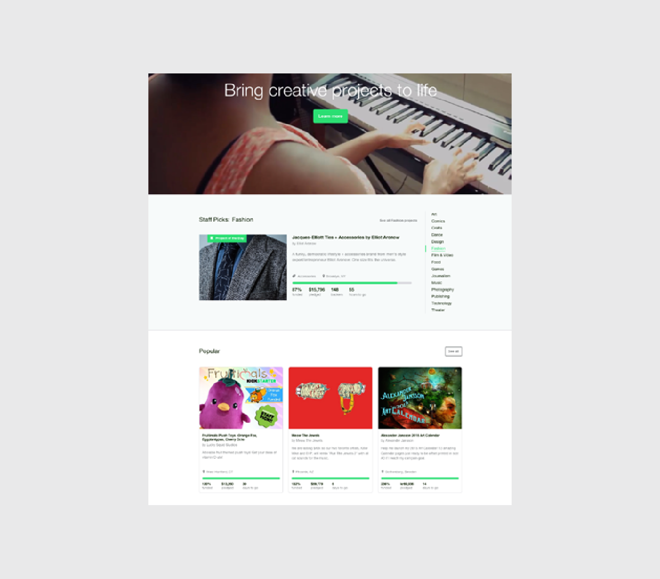
As you can see above, Kickstarter breaks its page into 3 distinct rows. The third row demonstrates the "awkward" row, variating from the pre-established pattern by laying out some widgets vertically (as it were, around the 1000-pixel mark).
Understand that people generally scan large chunks of content in an F-pattern, then alter it as needed to suit your site's brand and personality. As you modify the pattern, make sure you follow these rules described by A List Apart for ratios and grids.
Takeaway
The F-pattern doesn't just apply to text.
Any time you show a variety of content, you'll need to organize it somehow. The F-pattern simply follows the common trends of the human eye so that you can optimize the structure of your layout. You don't need to follow it rigidly — it's a guideline, not a template. Even if all you take from this is to punctuate your top navigation bar with a call-to-action in the corner, that minor tweak could make all the difference.
Web Ui Design For The Human Eye
Source: https://uxpin.medium.com/web-ui-design-for-the-human-eye-color-space-contrast-part-1-1700498e6d41
Posted by: jonesprich1962.blogspot.com

0 Response to "Web Ui Design For The Human Eye"
Post a Comment